|
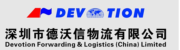
Corporate identity paraphrase
The core graphics fusion of ocean freight , air freight, land transport and multimodal transport graphic elements as a whole.
Red pattern is the tail section of the airplane, meaning of Air freight; blue flag pattern represents the Ocean freight; a map of the world pattern representatives of the whole earth, contains the elements of sea, air and land, more indication of Devotion logistics business and logistics services throughout the five continents, all over the world.
English "DEVOTION" stand for we devote in the development and innovation of logistics business. Devotion people always focus on the logistics industry, to provide consistently “high quality, efficient, and safe" logistics services as the core undertaking .
l “DEVOTION" is a homonym for "Chinese DE WO XIN", meaning of our logistics business is based on “Morality and trustworthy”, we practice business ethics, occupation morals, honesty and creditable, which will have the enterprise to possess fertile soil of development ,will get rapid growth in this piece of fertile land and growth into the towering big tree, the logistics industry's flagship, and this is our business vision and pursuit.
Red and blue of the logo color : The blue is meaning of mature and stable like the ocean , wide and vast like the sky ;The red represents positive and enthusiasm, passion and vigor. Which show the glorious prospects for the development of enterprise.
The logo is simple and generous, good visibility, and easy to remember, very characteristics of the industry and the international color.
|